Good Design Is Not the Same as Design That Sells
Every print shop and merch store has a graveyard: beautiful designs that nobody bought. The gap between admired and purchased is not talent — it is targeting. A design sells when a specific person sees it and thinks “that is so me” (or “that is so them,” for gifts) within two seconds, because merch is identity worn in public. The custom merch design ideas in this guide are organised around that moment of recognition: niche identity, local pride, occasions, typography that carries the joke by itself, and the unglamorous testing discipline that separates a catalogue of sellers from a folder of almosts. Whether you print in-house or use print-on-demand, the principles are the same: design for a wearer, not for a portfolio.
Niche Identity: Smaller Audience, Stronger Signal
The best-selling merch rarely targets “everyone who likes cats”; it targets left-handed bassoon teachers who cuddle rescue cats — and the exaggeration points at the truth: specificity is what triggers recognition. The formula with a long commercial history combines two or three identity markers the buyer already wears proudly: a profession plus a hobby, a fandom plus a life stage, a city plus an inside joke. Professions are a goldmine — nurses, teachers, electricians, farmers, truck drivers — because work identity is worn daily and bought as gifts by colleagues who know exactly who it fits. Life moments work the same way: new parents, retirees, graduates, dog-adopters, first-time homeowners. Research method: spend time where the niche gathers (forums, groups, comment sections) and collect its actual phrases, grievances, and jokes; the design that quotes the community’s own language back to it outsells the clever outsider’s invention almost every time. Then design the series, not the one-off: a buyer who finds one shirt “so them” looks for the second, and series are where a small store’s revenue actually lives.
Local Pride and Occasions: Demand With a Calendar
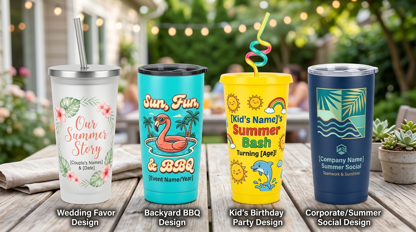
Two demand engines run on rails. Local pride: neighbourhood names, area codes, local landmarks drawn simply, the phrases only locals say correctly — these designs sell year-round to residents and spike with tourists, relocators, and homesick expats, and they are giftable in a way generic slogans are not. Keep the execution clean and the references accurate; locals forgive simple art and never forgive a wrong detail. Occasions: the calendar is a free product roadmap — Mother’s and Father’s Day, graduation season, wedding parties (bride squads and bachelor crews are group purchases, the friendliest kind), sports seasons, awareness months, and the long Christmas runway. The discipline is timing: occasion designs must be live six to eight weeks before the date, because buyers shop ahead and search engines need time to find you. Build the calendar once, in January, and half your year’s design list writes itself — leaving your creative energy for the niche work that compounds. And when the orders come, the numbers underneath must work too: the margin discipline in our companion guide on pricing handmade products applies to every unit you ship.
Typography First: When the Words Are the Design
The most reproducible merch skill is not illustration — it is lettering. Typography-led designs (a phrase, set beautifully) dominate best-seller lists because they are fast to produce, cheap to test, and legible at thumbnail size, where all online buying decisions happen. Craft rules: two fonts maximum, contrasted deliberately (a bold display face against a clean sans); hierarchy that puts the punch word biggest; letter-spacing and line breaks treated as composition, not defaults; and the squint test — if the phrase cannot be read at arm’s length in three seconds, the layout is not finished. Vintage-distressed, collegiate, and minimal-modern are the three evergreen styles; pick per audience rather than per taste. Illustration-led designs still matter — mascots, line-art animals, retro sunsets — but even these usually win or lose on the words beneath them. Build a small library of your proven layouts and re-skin them per niche: the tenth iteration of a winning structure is the highest-value hour in a merch business.
Test Before You Scale: Let Buyers Do the Arguing
Taste is a hypothesis; sales are data. With print-on-demand or short digital runs, the cost of testing has collapsed — use it. Launch designs in small batches, watch click-through and conversion rather than likes (compliments are free and worth exactly that), and kill or rework the bottom half without sentimentality. A design that fails usually fails for one of three fixable reasons: the phrase is right but the lettering is weak; the concept is right but the audience targeting is off; or the mockup does not show the design clearly at buying size. Fix one variable and retest before abandoning the idea. Protect the winners properly, too: check trademark databases before scaling any phrase near a brand, team, or celebrity reference — a takedown after a viral week is the most expensive lesson in this industry — and keep your original files organised, because the design you forget is the one a customer will ask for next season.
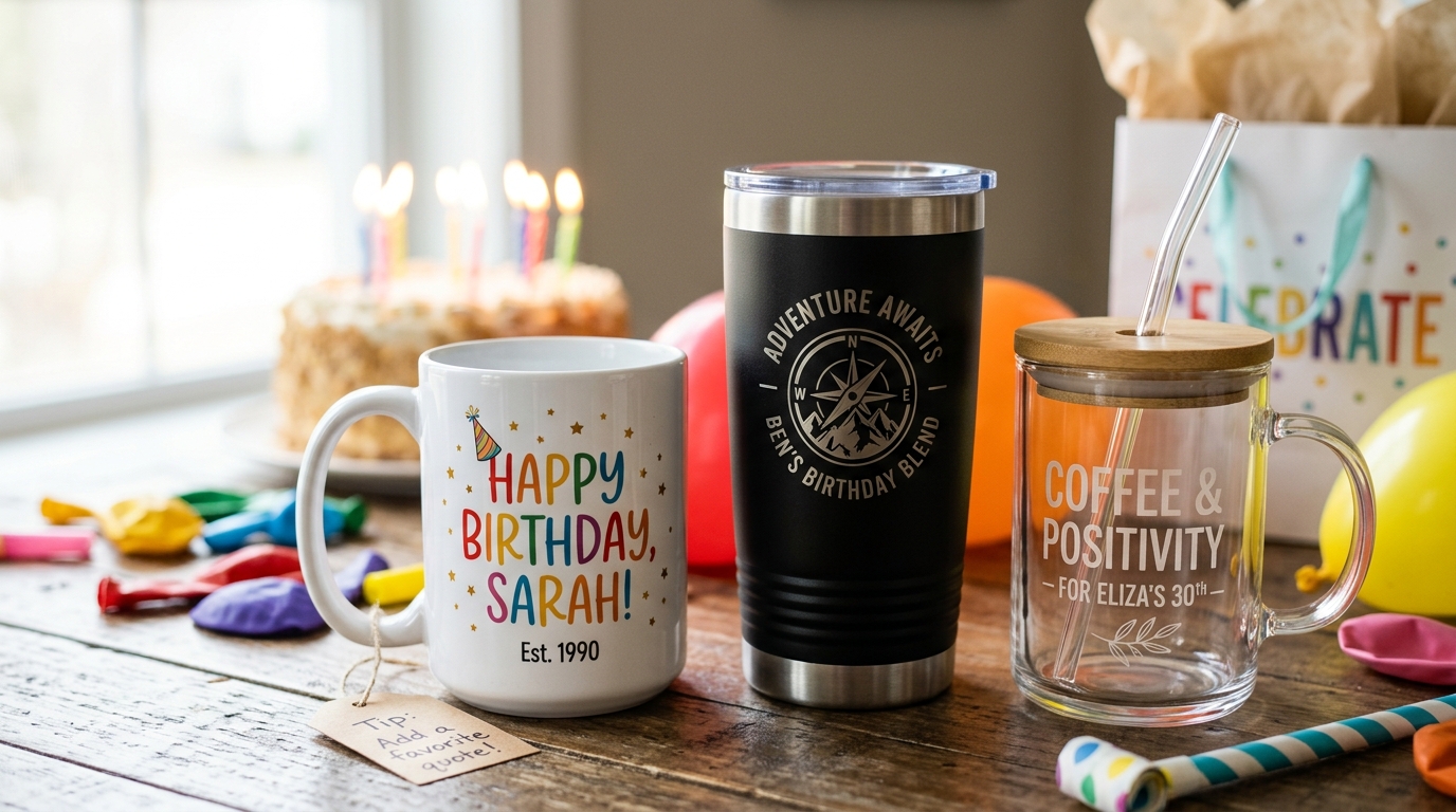
One presentation rule pays for itself weekly: the mockup is the product at the moment of decision. Show the design worn or used, at realistic scale, in the colours you actually offer — and keep the first image uncluttered, because search results are judged in a grid of thumbnails where confusion scrolls past. Sellers routinely double a listing’s conversion by reshooting the mockup alone, without touching the design. Before blaming a concept, interrogate its presentation.
The Bottom Line
Custom merch design ideas that sell start from a wearer, not a canvas: niche identity stated in the community’s own words, local pride executed accurately, occasion designs launched on a calendar, typography that survives the squint test, and relentless small-batch testing that lets buyers vote with money. Design fewer, target sharper, test cheaper — and the graveyard stays empty.